SetCo
An identity built for movement — for a filing company whose whole promise is that opening a business shouldn't slow you down.
 Primary lockup · gradient
The moment things shift from planning to doing.
SetCo helps people open a company — the paperwork, the filing, the part everyone dreads. The brand had to do the opposite of what that process usually feels like. No friction, no noise, no forms-in-triplicate energy. Just forward.
So we built the identity around motion. Every decision — the mark, the palette, the way a headline breaks — had to feel like something already in flight.
A chevron with somewhere to be.
The icon carries a flying, forward motion — a wing and an arrow at the same time. It's confident and directional without shouting, and it was drawn on a strict construction grid so it holds its angle at any size, from an app icon to a billboard on the side of a building.
Clean lines, clear flow, no friction. That rule governed the whole system.
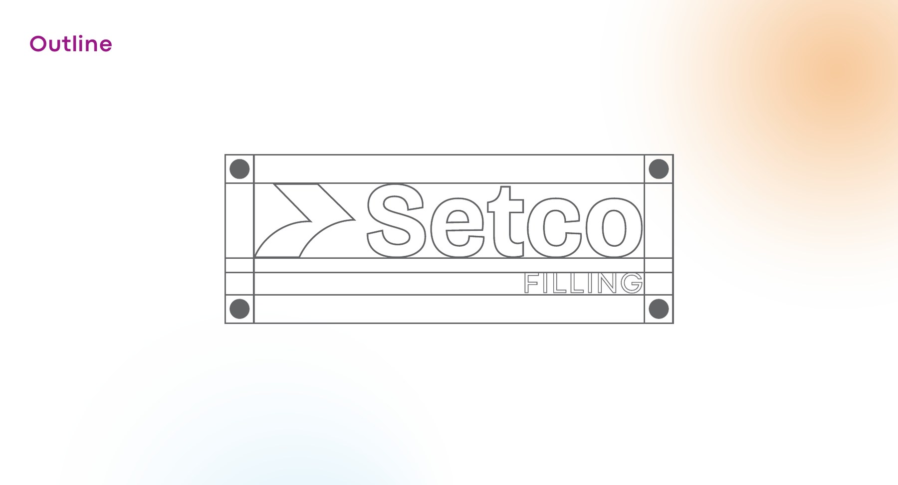 Construction & clear space
 Reversed · deep plum
 Primary · full colour
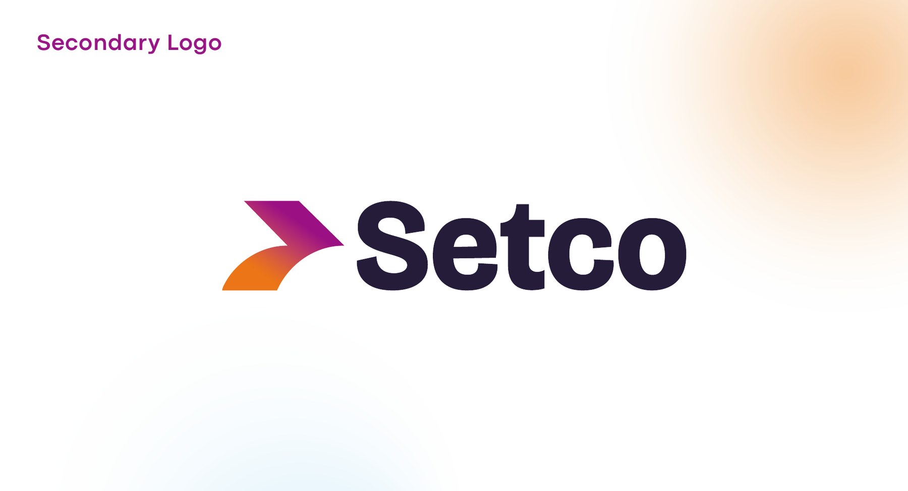 Secondary lockup
Two colours that travel into each other.
A single gradient does the heavy lifting: magenta into amber, always running in the direction of the mark. Held apart, the two anchors carry the system; blended, they become the movement the brand is named for.
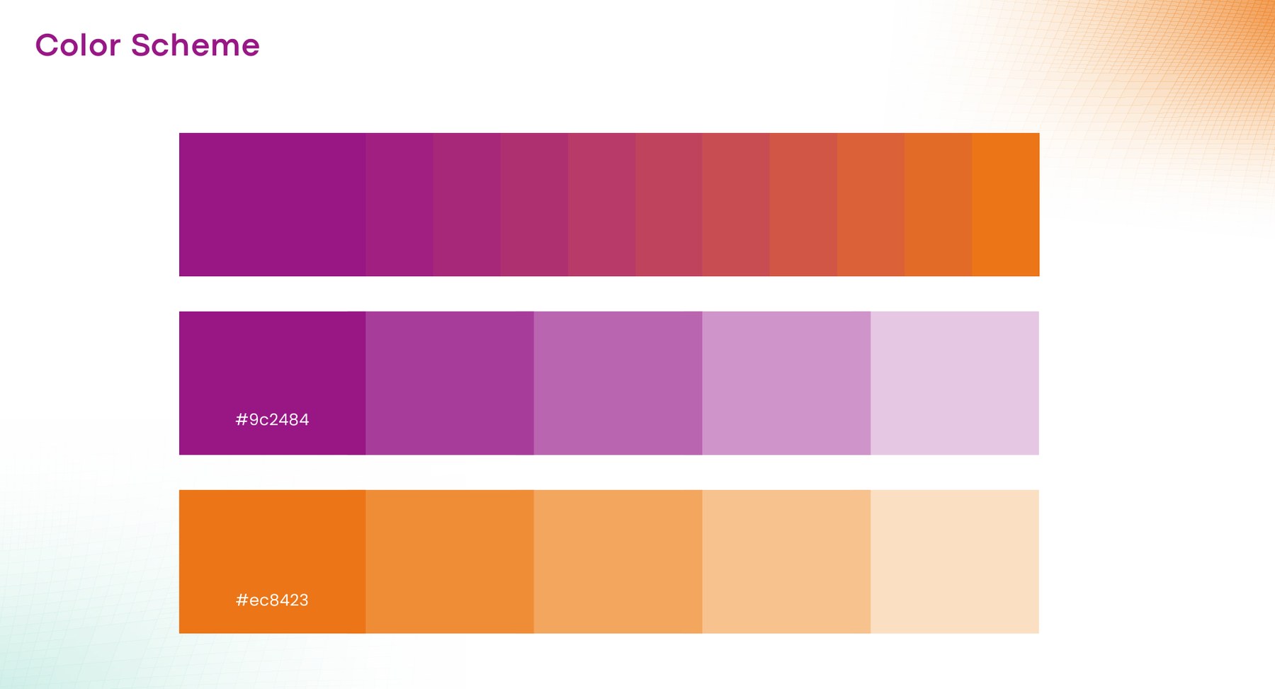 Palette & tint ramps
Geometric, open and slightly rounded — precise enough for legal copy, warm enough to sit on a coffee cup.
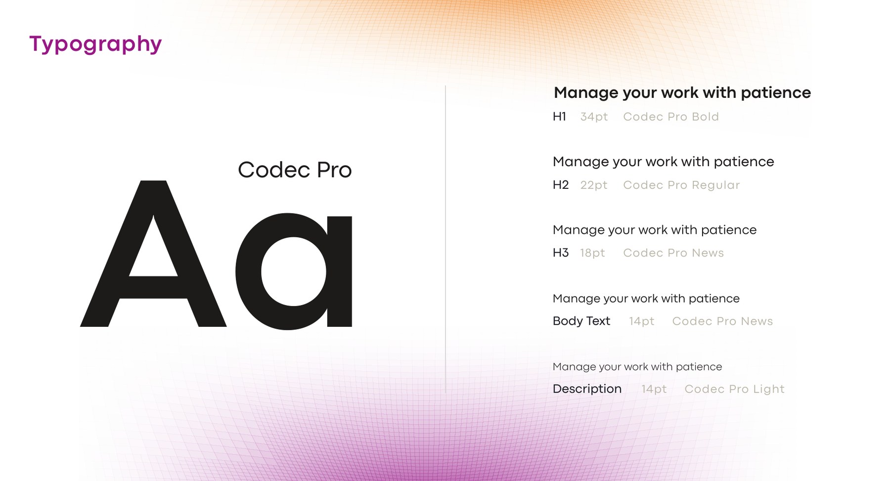 Specimen
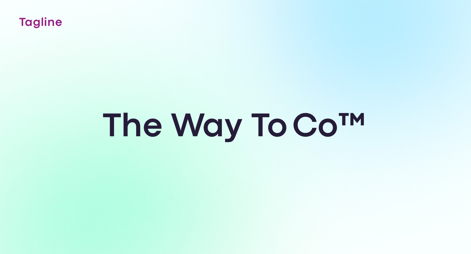
The way to co™
Three words that work as a promise, a pun and an instruction — and gave the campaign somewhere to go.
Open fast. Open smart. Open the right way™.
The campaign leans on things that only work when they're finally, properly open — a bottle, a wing, a screen. Out of home carries the joke; the stationery and the product surfaces stay quiet and exact, so the brand can be funny without ever looking unserious about the filing itself.
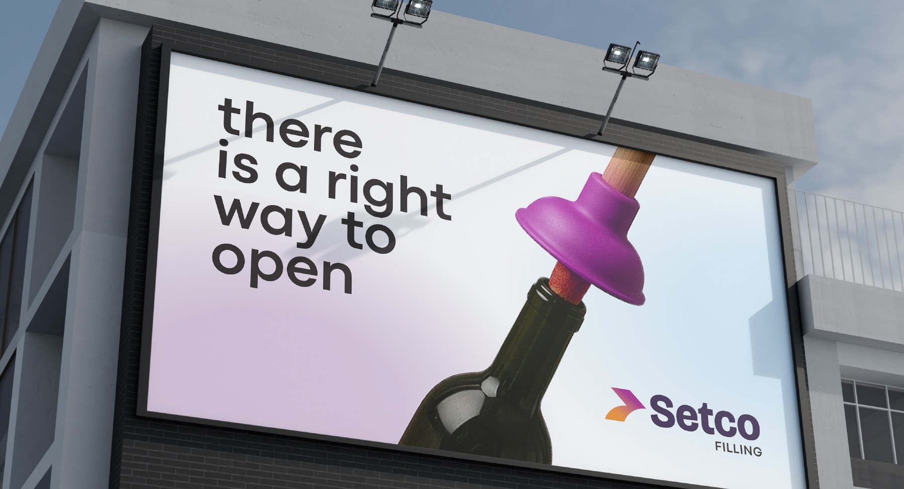 Out of home
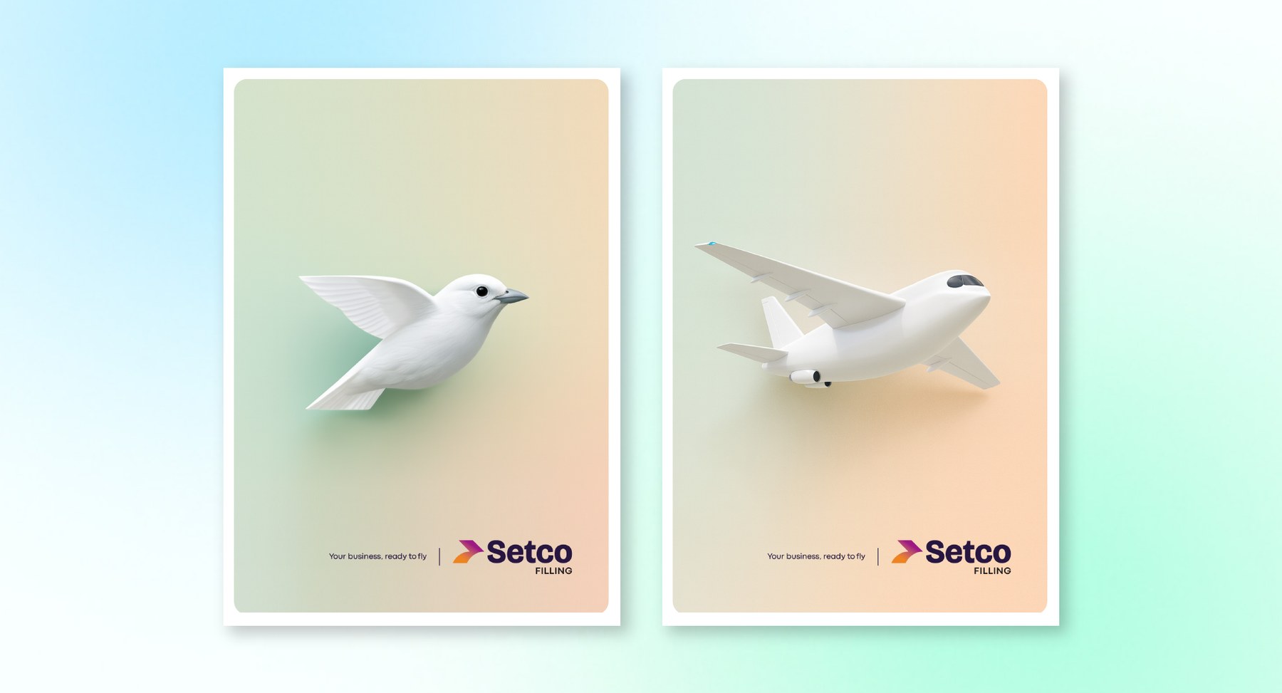 Poster pair · ready to fly
 Ready, Set, Coffee.
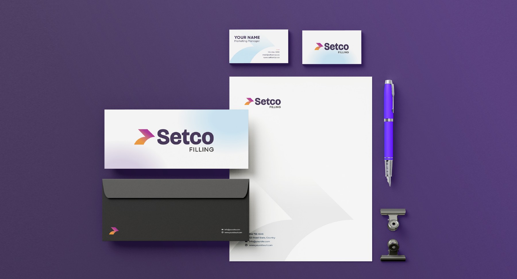 Stationery system
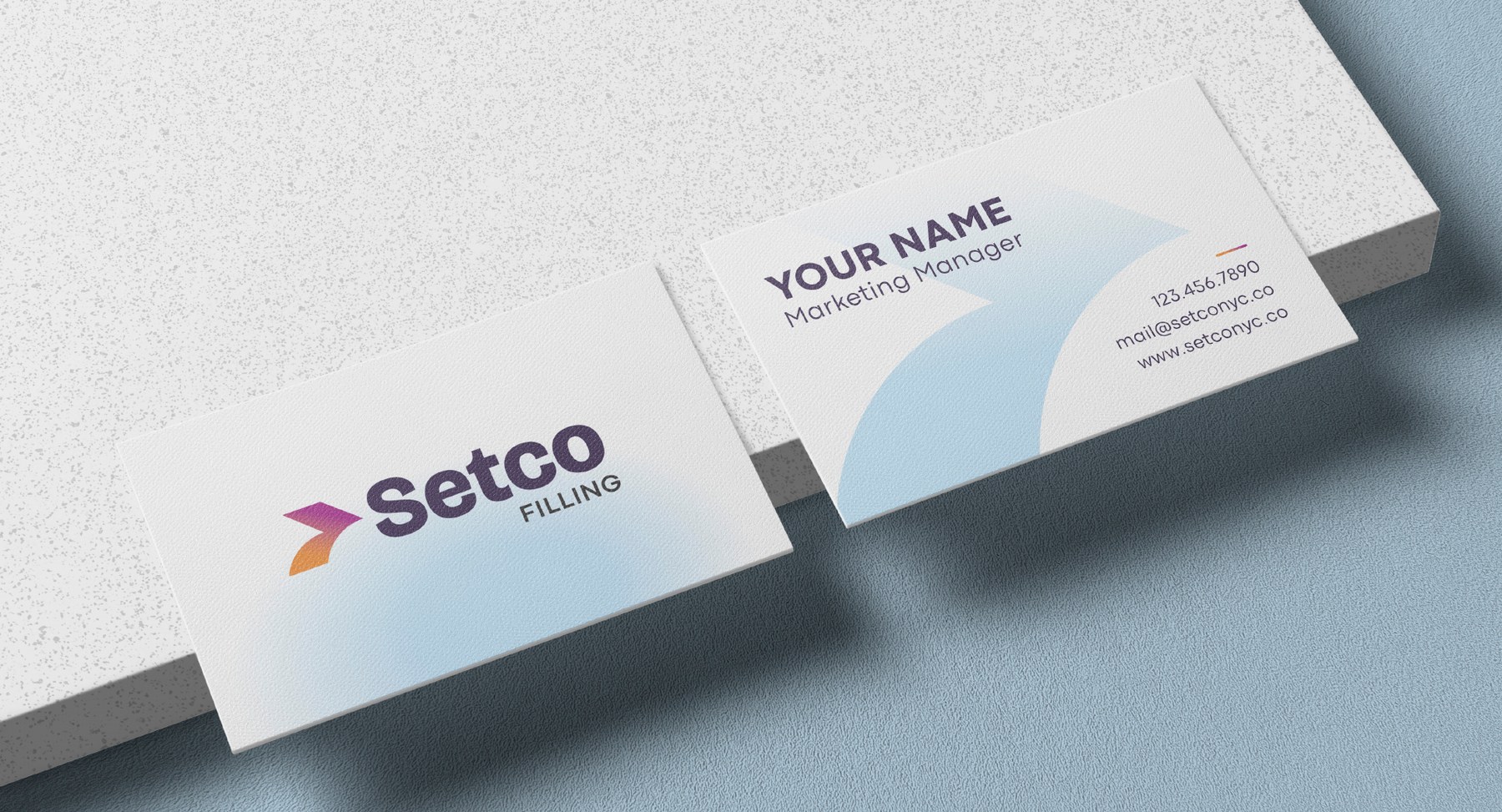 Business cards
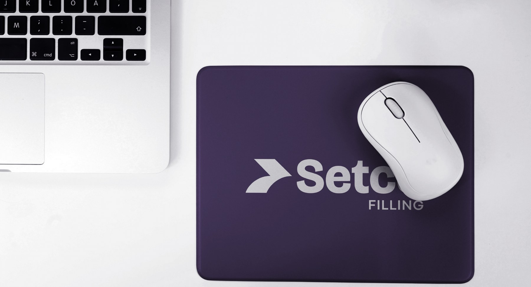 Desk objects
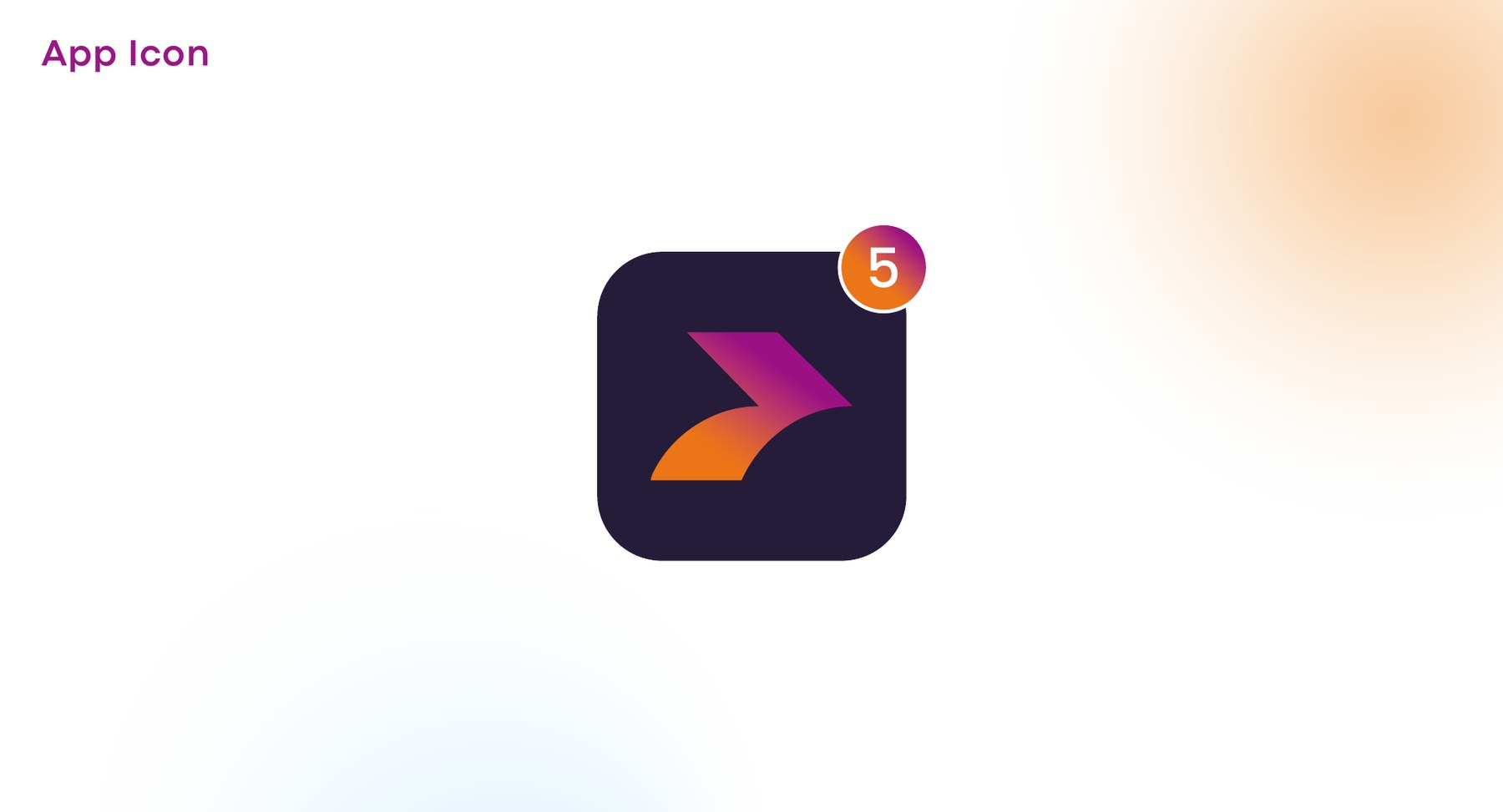 App icon
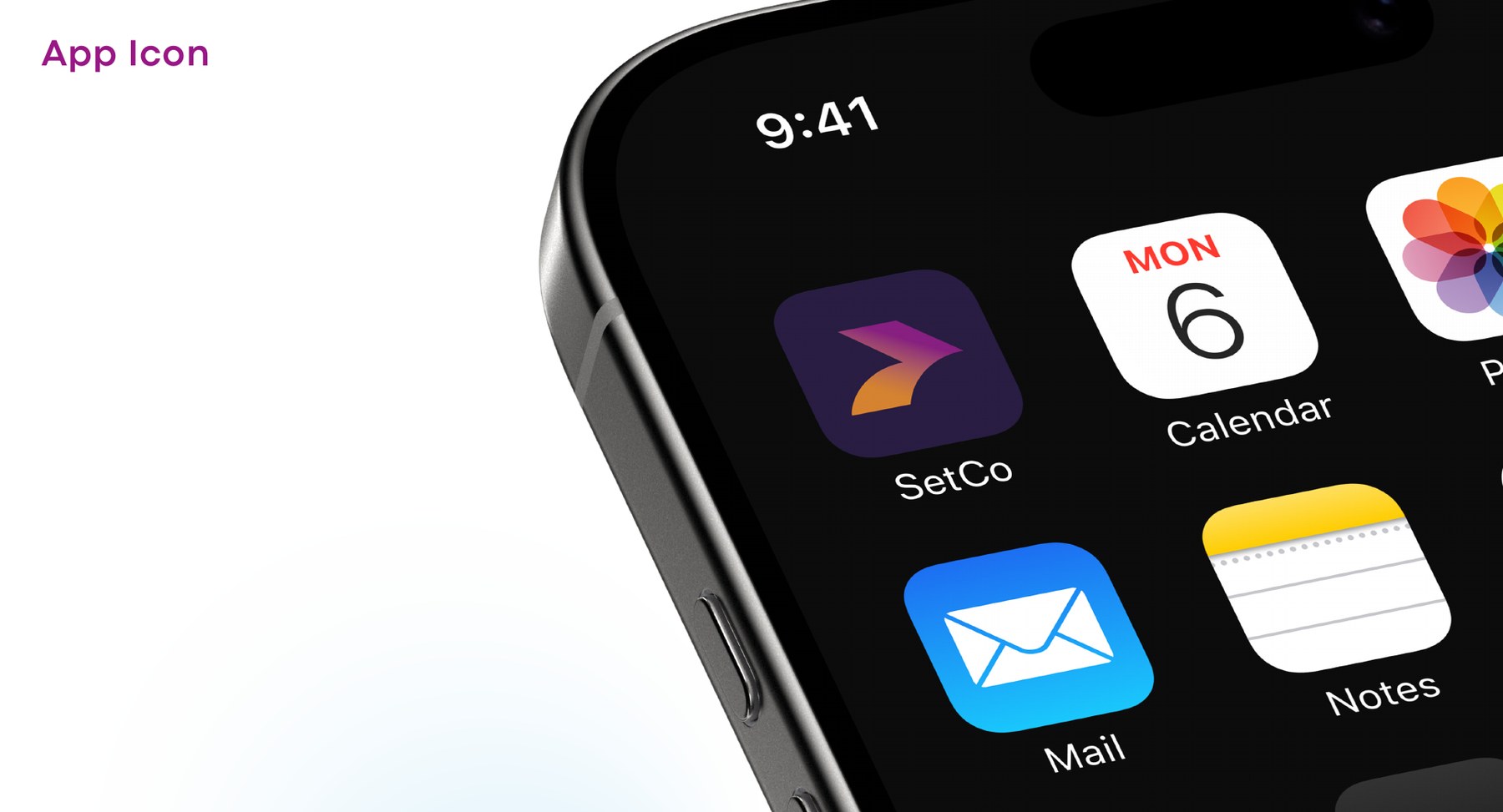 On the home screen
Set up a corporation from the couch.
Online, the tone gets personal. Real people, mid-scroll, already done — the site and social work leads with the relief on the other side of the paperwork rather than the paperwork itself. One button, one instruction: start co'ing.
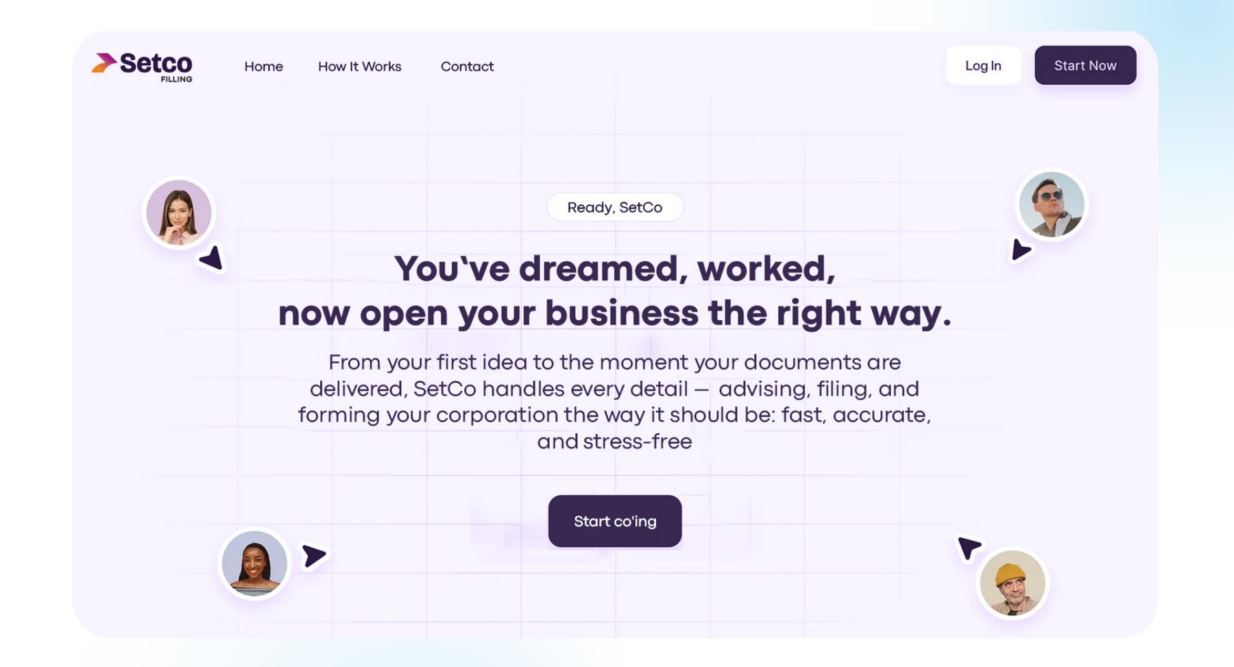 Landing page
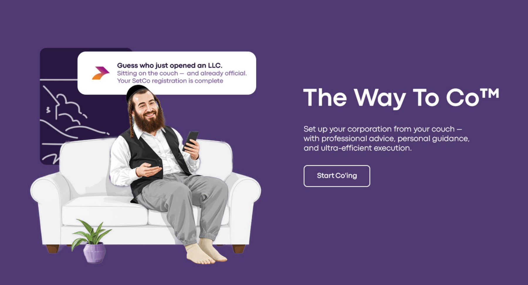 Social · the way to co™
 Tagline treatment
What happens when clarity meets action.
SetCo left with a system that moves the way the company does — direct, effortless, and impossible to confuse with the beige of the category it sits in. Because opening a business shouldn't slow you down. It should move you forward.
- Design Calibri Group®
- Collaboration Developed with the OffBrand team — Benzion Guttman and Chaim Geller
- Typeface Codec Pro
- Year 2025